Why the Redesign?
Why is it being redesigned? Does it need better user experience, does the UI need a fresh look or is the design simply outdated?
It can be a combination of all three, which was a deal in our case.
User opinion
When redesigning an app, there is of course, a known base of users which were using it and will be using your new version of it.
A redesign can have two outcomes:
a) It is clear what the updated version has to offer and the users love it,
b) Users are completely baffled and they stop using it.
In our redesign adventure, we wanted for the user engagement to go up, we wanted to deliver a great user experience with an app that is intuitive and of course, not let the b) option happen.
Instagram redesign
When it comes to Instagram’s redesign many people didn’t like it at first, but it didn’t stop them from using it because the user experience was still the same. Change is hard for people in every situation, so in the world of apps as well.
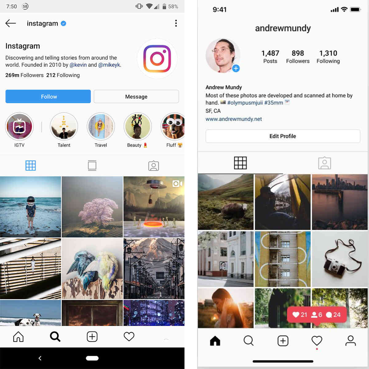
Even if it’s a whole new look of the interface or only one feature, people will notice and people will talk about it.
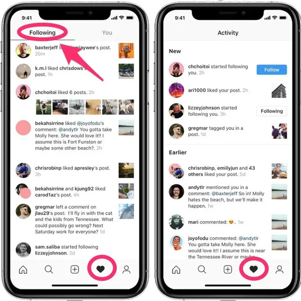
When Instagram removed its feature of being able to see what your followers liked (which was by all research not used very often) people were baffled and angry, just because it was a change and they wanted to have a say in it, not because they actually used it or were disappointed it doesn’t exist anymore.
Things to keep in mind
Competitive analysis & design trends
One of the first things you want to do is identify why you’re doing the redesign as mentioned in the first step.
Is it possible that some recent trends in design did a little push in the redesign direction? With one of our projects, we took in consideration neumorphism trend of 2020, however, reaching deeper into it, we have realised that is not the greatest solution for usability. Even though it may be hyped up now, a) it won’t last for long b) it may look good on shots on Dribble but not in practice.
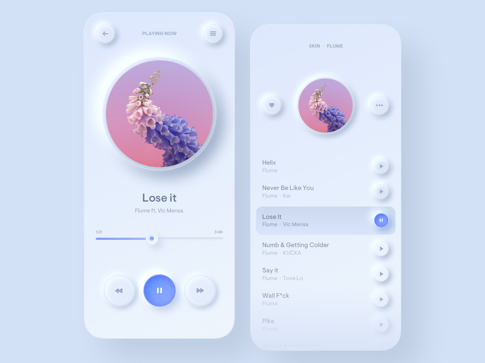
Another important step is competitive analysis. Spend time downloading and using other apps to see where your app is in comparison. What can you learn from similar apps and what can you use as inspiration?
Reading Customer Reviews
When you think of customer reviews, you probably think of the overall score and positive reviews. However, in this case, negative comments are your friends. You want to see what people didn’t like, why they had difficulties with a certain feature and so on. Therefore, stay on the look out for negative reviews because they can actually offer greater insight.
Existing branding
When talking about branding, it’s not only colour palettes and logos, people are creatures of habit. If they know that a button for sharing their post is in the right corner of the app, they will be looking for it in the redesigned version. However, to keep it simple for now, be mindful of changing your colour palette, stay in the same hues but play with typography and different states including loading screen and error screens.

Wrapping up
Before starting your redesign project, make sure you’ve taken the above questions into account. You want to clearly define which elements or features are outdated or have stood the test of time.
In conclusion, redesigning an app can be more challenging than designing from scratch. Don’t take shortcuts because shortcuts can lead to a steep creek. Without doing the research first, bad redesigns can lead to another redesign to fix all the previous issues.
Check out our Nabava.net case study to see our take on redesigning Nabava.net app.


