

Faster, more intuitive price comparison for effortless deal-finding

What the Nabava.net delivery record supports
CoreLine rebuilt the Nabava.net mobile app for a price-comparison catalogue whose scale the client states as more than half a million products from over 150 online stores. The engagement has run since 2020 and covers UX research, information architecture, UI design, and cross-platform development.
- 5 levels of nested categories
- The catalogue's category tree runs up to five levels deep and is rendered by a recursive component architecture built for this project.
- React Native iOS and Android from one codebase
- The app was fully redeveloped cross-platform, with React Navigation handling gestures and transitions.
- Since 2020 continuing engagement
- The relationship covers research, IA, design, and development rather than a single fixed-scope release.
Evidence basis: CoreLine's project delivery record, the technical scope documented in this public case study, and catalogue-size figures provided by Nabava.net.
Scope note: Catalogue and store counts are client-stated platform figures, not CoreLine measurements. No post-launch conversion, retention, or performance metrics are published for this engagement.
UX RESEARCH
UI DESIGN
MOBILE DEVELOPMENT
INFORMATION ARCHITECTURE
USER TESTING
PRODUCT STRATEGY
Nabava.net is one of the leading price comparison platforms in the region, offering users access to over half a million products from more than 150 online stores.
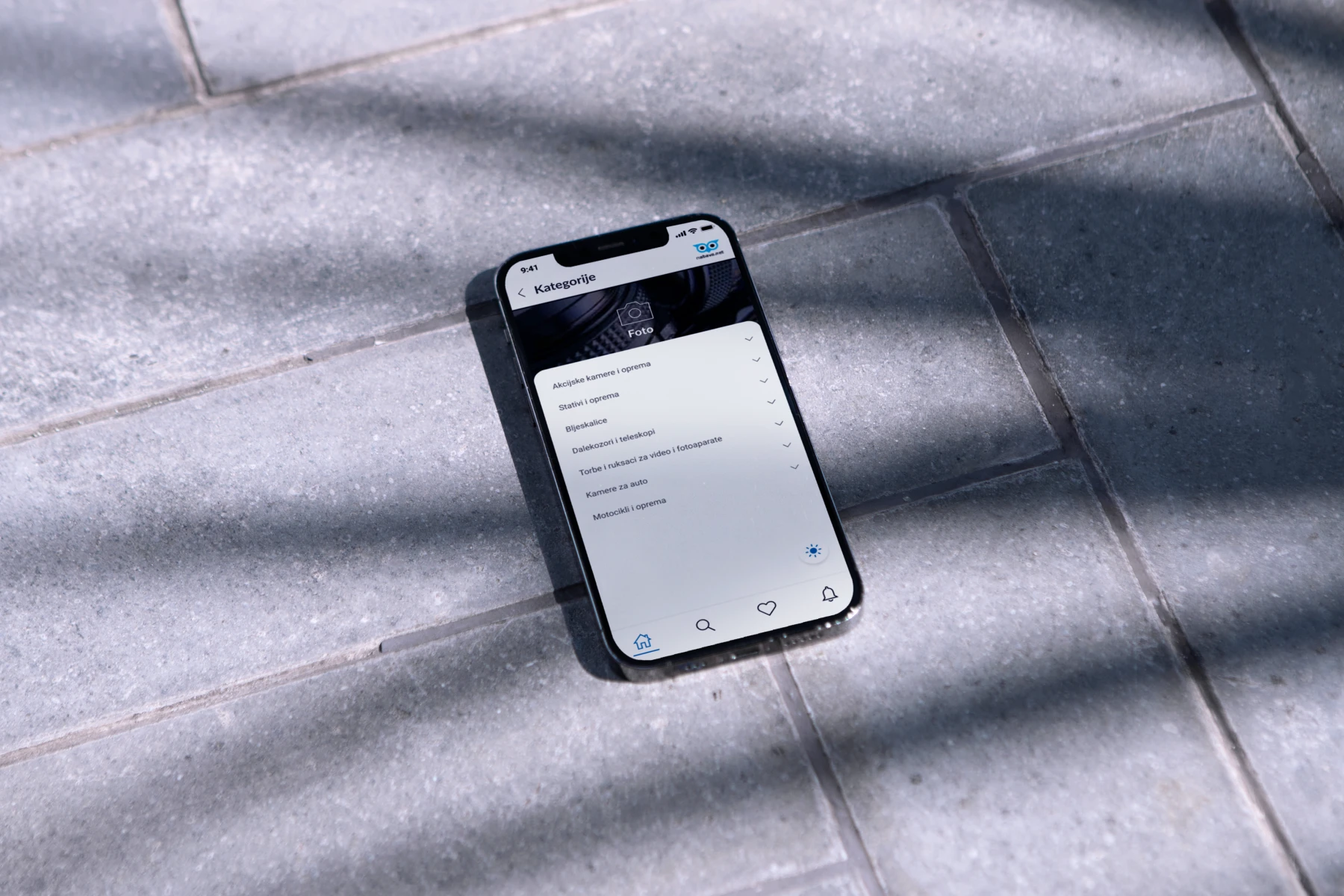
Redefining the digital shopping journey
When we joined the project, Nabava.net already had a strong online presence, but its mobile experience lagged behind. Our mission was to rebuild the app from scratch, enhancing usability, structure, and overall performance while maintaining brand recognition.
The goal was straightforward yet ambitious: create a modern, intuitive, and scalable shopping companion that appeals to every user - from tech-savvy teens to experienced bargain hunters.
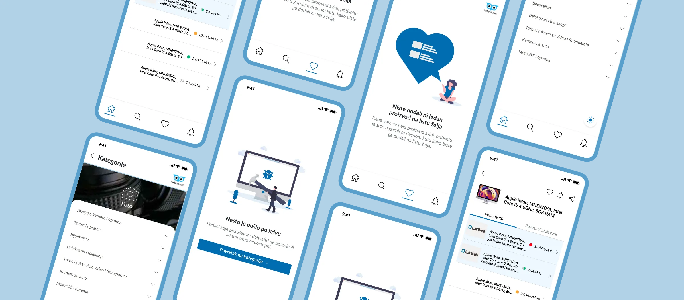
Making simplicity work at scale
Redesigning an established app with thousands of daily users is always complex. The primary challenge lay in improving navigation and visual hierarchy while ensuring that a massive product catalog - with up to five levels of subcategories - remained easy to browse.
The interface needed to handle complexity without overwhelming users. We aimed to design a clear, lightweight experience that makes searching and comparing offers feel effortless.
Understanding a broad and diverse audience
A redesign isn’t about surface changes - it’s about transformation. To deliver meaningful impact, our research phase was intensive and data-driven.
User personas Unlike most digital products, Nabava.net serves a remarkably wide user demographic - from teenagers exploring their first online purchases to retirees comparing household goods. This insight deeply influenced every design and usability decision.
We also drew on traffic analytics, with up to a million monthly website visits, to identify behavioral trends and key user expectations for the mobile experience.
Rebuilding the foundation of navigation
Improving the information architecture was one of the most significant changes in this redesign.
Previously, the app’s menu included redundant layers that made navigation cumbersome. We streamlined the structure by removing unnecessary menu items and creating a hierarchical category layout that feels natural and efficient.
All categories and subcategories are now accessible from a single unified screen, allowing users to explore deeper product levels without confusion. To prevent clutter, the interface dynamically limits visible layers, maintaining focus and simplicity.
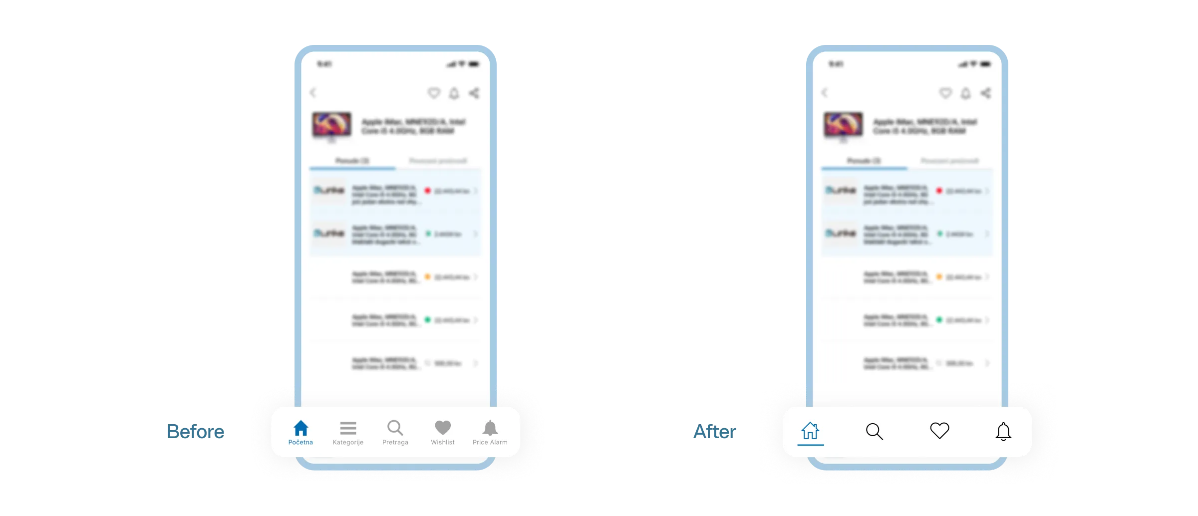
Focused, modern, and product-driven
The visual redesign embraced Nabava.net’s signature dark blue brand color, using it as an accent across a clean and minimal interface. Outlined icons, light blue tones, and ample white space give the app a modern, breathable look - ensuring that the products remain the central focus.
Key improvements:
- Reduced category screens from four to one
- Simplified hierarchy and improved legibility
- Introduced lighter color tones for better contrast
- Enhanced offer screens for faster product comparison
Each offer screen was restructured to present all essential information at a glance, from prices and product images to store availability, without visual overload.
A new foundation built for performance and scalability
The app was fully redeveloped in React Native, chosen for its cross-platform efficiency and smooth animations. React Navigation ensured intuitive gestures and transitions, creating a fast and fluid browsing experience.
One of the biggest technical challenges was managing deeply nested category trees - up to five levels deep. We solved this with a recursive component architecture, allowing seamless rendering and navigation across complex hierarchies.
A cleaner, faster, and smarter shopping experience
The redesigned Nabava.net app offers an intuitive navigation system, a refined visual identity, and an overall smoother user experience.
Users can now:
- Browse categories and subcategories effortlessly
- Compare offers directly within the app
- View and manage wishlists instantly - without refreshing
- Experience engaging empty states that encourage exploration
These are the capabilities the rebuild delivered. Nabava.net holds the store-side analytics for the app, so this page does not publish conversion, retention, or session figures for the relaunch.