Digital sustainability for families across the UK

UX RESEARCH
UI DESIGN
MOBILE DEVELOPMENT
BACKEND DEVELOPMENT
USER ANALYTICS
PRODUCT STRATEGY
A London-based mobile platform enabling parents to trade or donate unused children’s items — from toys to clothes — completely free of charge.
The initiative helps families save money, reduce waste, and contribute to a circular economy. Having expanded nationally with over 100,000 users across the UK, YoungPlanet continues to promote sustainable living through community sharing.

Transforming an app for conscious parenting and sustainable living
When YoungPlanet approached us in 2020, the app required a complete redesign to support its upcoming national launch. Originally built by another company, it struggled with UX challenges, performance issues, and scalability concerns.
Our mission was clear — preserve functionality, elevate the experience, and prepare the app for growth.
Balancing optimization with new features
The inherited codebase presented several technical limitations and design inconsistencies that hindered performance. At the same time, user engagement was declining due to complex navigation and limited features.
The challenge was to rebuild the app without disrupting existing users, ensuring smooth migration and improved usability.
To achieve this, we needed to:
- Understand user behavior and retention patterns.
- Improve app performance and responsiveness.
- Implement features that enhanced community interaction and product discovery.
Understanding users before redesigning for them
We began with a deep dive into user behavior analysis. Our goal was to strengthen loyalty among existing users while attracting new families nationwide.
Persona insights
YoungPlanet users were already well-defined: parents looking to donate, exchange, or receive items for their children. However, defining personas wasn’t enough — we needed real behavioral data to guide design decisions.
By integrating Amplitude Analytics, we gained valuable insight into conversion paths and drop-off points, helping us identify friction areas and optimize every interaction.

Simplifying, reorganizing, and humanizing the experience
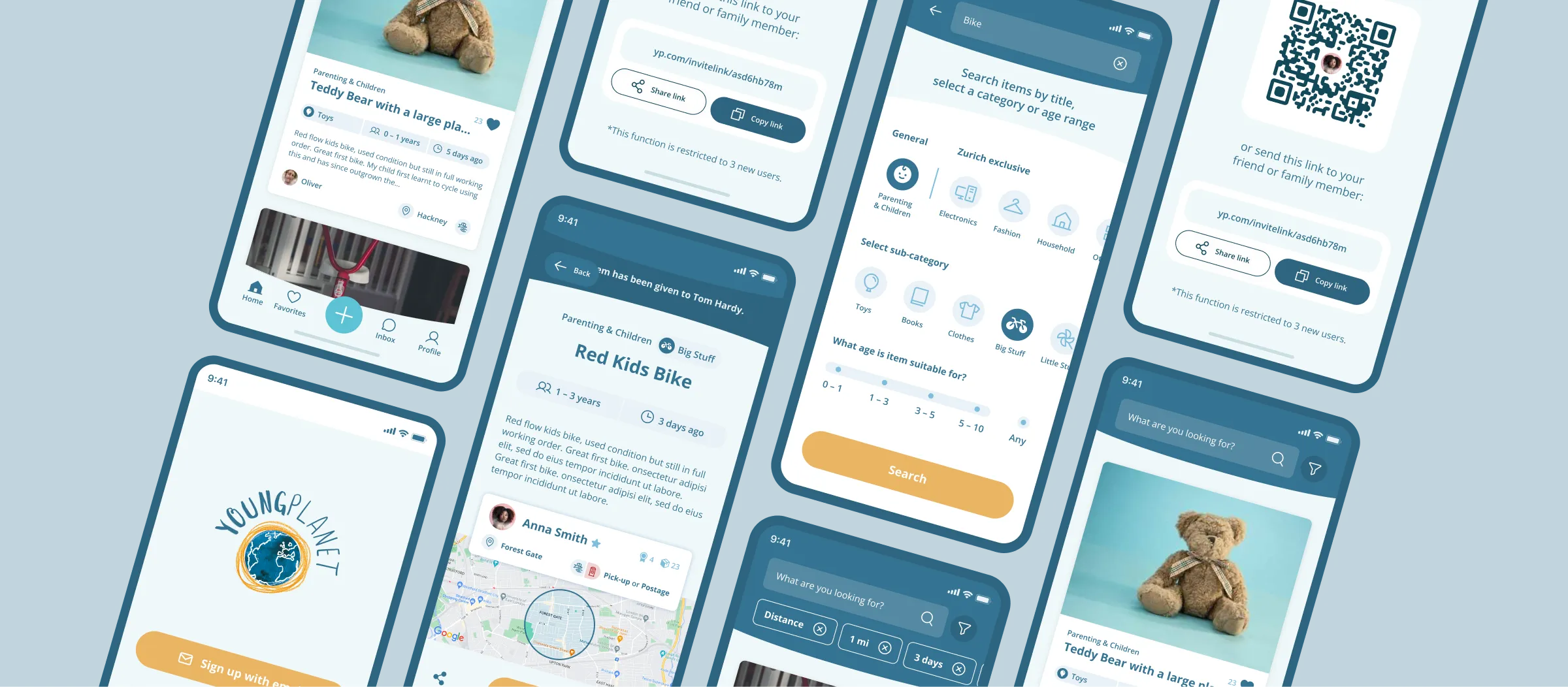
The focus of the redesign was on clarity and usability. The main product screen — where users browse or request items — was cluttered and visually inconsistent.
We reorganized the layout, streamlined information hierarchy, and crafted a cleaner, more intuitive interface that allows parents to navigate seamlessly between browsing, posting, and chatting.
Key improvements:
- Simplified product details layout
- Improved accessibility and visual balance
- Streamlined interaction flows

Building engagement through smarter functionality
To meet users’ evolving needs, we introduced a set of new features designed around convenience and connection.
Sorting Filters
Users can now filter items by distance, ensuring easier coordination between families for local exchanges. This improvement alone significantly increased in-app engagement.
In-App Chat
To encourage direct communication, we integrated a built-in messaging system — allowing users to coordinate exchanges securely within the app.
Notification System
Using behavioral data, we developed personalized notifications that adapt to user intent — from donation reminders to nearby item alerts. This created a more meaningful, user-centered experience.

Fast, scalable, and optimized for growth
We rebuilt YoungPlanet using React Native for cross-platform performance across iOS and Android. The backend was refactored in Node.js, ensuring a faster and more reliable infrastructure.
All systems are hosted on Amazon Web Services (AWS) to maintain scalability and uptime as the user base grows.

From local initiative to nationwide impact
After months of design iteration, code refactoring, and feature expansion, YoungPlanet successfully relaunched across the UK.
The result:
- Improved app stability and loading times
- A seamless, modern UX
- Increased engagement and retention
- A ready foundation for continued growth
We didn’t just improve an app — we helped empower a community and support a sustainable lifestyle movement for parents across the country.


