Elevating digital education: an interactive e-learning platform for schools

UX/UI DESIGN
WEB DEVELOPMENT
PRODUCT STRATEGY
LMS IMPLEMENTATION
CONTENT MANAGEMENT SYSTEM
Naklada Ljevak is one of Croatia’s leading educational publishers, with decades of experience producing learning materials for schools across the country.
We partnered with them to design and develop a modern e-learning platform that connects teachers and students through interactive digital textbooks, built on the latest LMS (Learning Management System) standards.
The goal was simple but ambitious — to modernize education and make teaching and learning accessible, engaging, and intuitive for everyone.

Bringing education into the digital era
Naklada Ljevak approached us with the vision of reimagining their existing e-learning system — transforming it from a static platform into a dynamic, interactive educational environment.
The project required a complete redesign of both the user experience and the brand identity, ensuring that teachers and students could interact with digital textbooks in entirely new ways.
Rebuilding from the ground up
The initial platform offered only static PDFs with minimal engagement. As a result, teachers saw little value in using it, and student adoption remained low.
Our challenge was to completely redefine the user experience, build a more powerful and intuitive eBook system, and make the platform genuinely useful to educators and learners alike.
Beyond design, we also needed to overhaul the brand’s positioning, aligning it with modern digital learning expectations while keeping the interface simple enough for users of all ages and tech abilities.
From static to interactive learning
Our vision was to create an e-learning platform that would allow teachers to add interactive multimedia content directly to eBooks — including photos, audio, and video — enriching lessons and giving students deeper, more engaging experiences.
The platform needed to function equally well for primary school students and teachers, balancing accessibility, usability, and visual clarity.
Design built on understanding
Our process began with extensive research — analyzing competitors, defining user personas, and understanding the behavioral patterns of educators and students in the Croatian school system.
Persona development
We identified two main user groups:
- Teachers, many of whom belonged to older generations less accustomed to technology.
- Students, digital natives who expect quick, responsive, and visually engaging experiences.
This duality shaped every design decision — from typography and iconography to navigation and interface simplicity.
Information architecture
We built a clear, intuitive structure with emphasis on the most-used features: digital textbooks, classroom materials, and shared resources. Menus were simplified and streamlined, reducing clutter while ensuring that important educational content remained one click away.
Balancing clarity, accessibility, and engagement
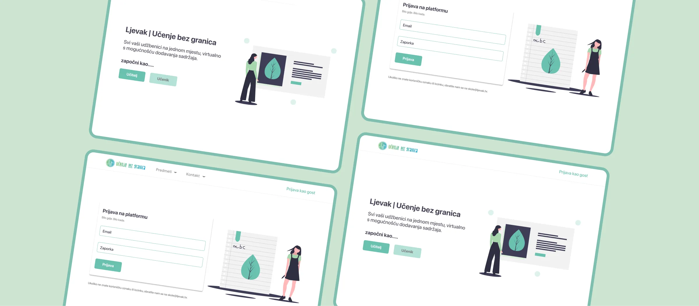
The visual direction was influenced by the brand’s existing colors but refined to match modern e-learning aesthetics — clean layouts, ample whitespace, and a focus on readability.
Typography and iconography were optimized for cross-generational usability, ensuring that both teachers and students could navigate the platform with ease.
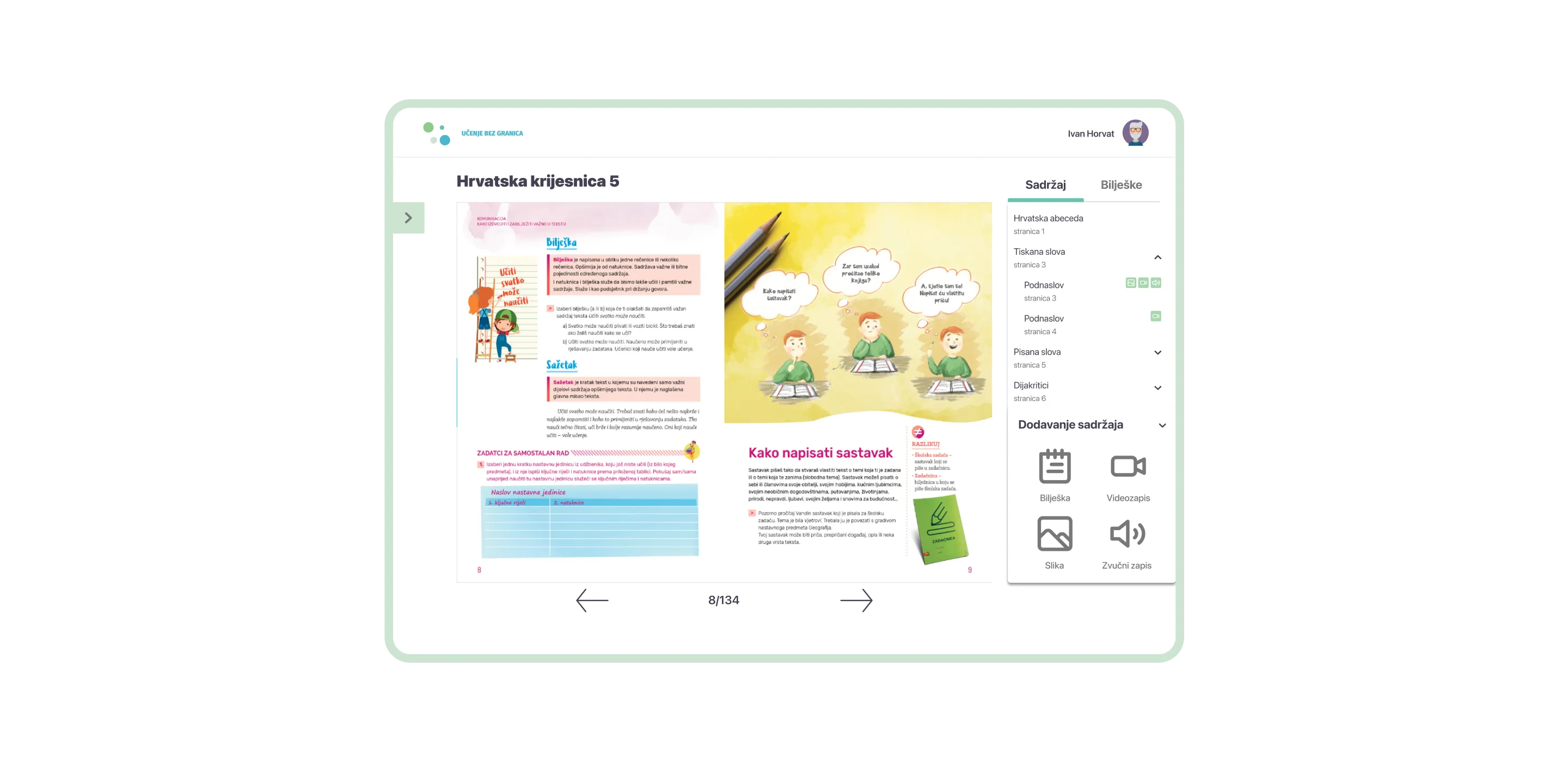
eBook Reader
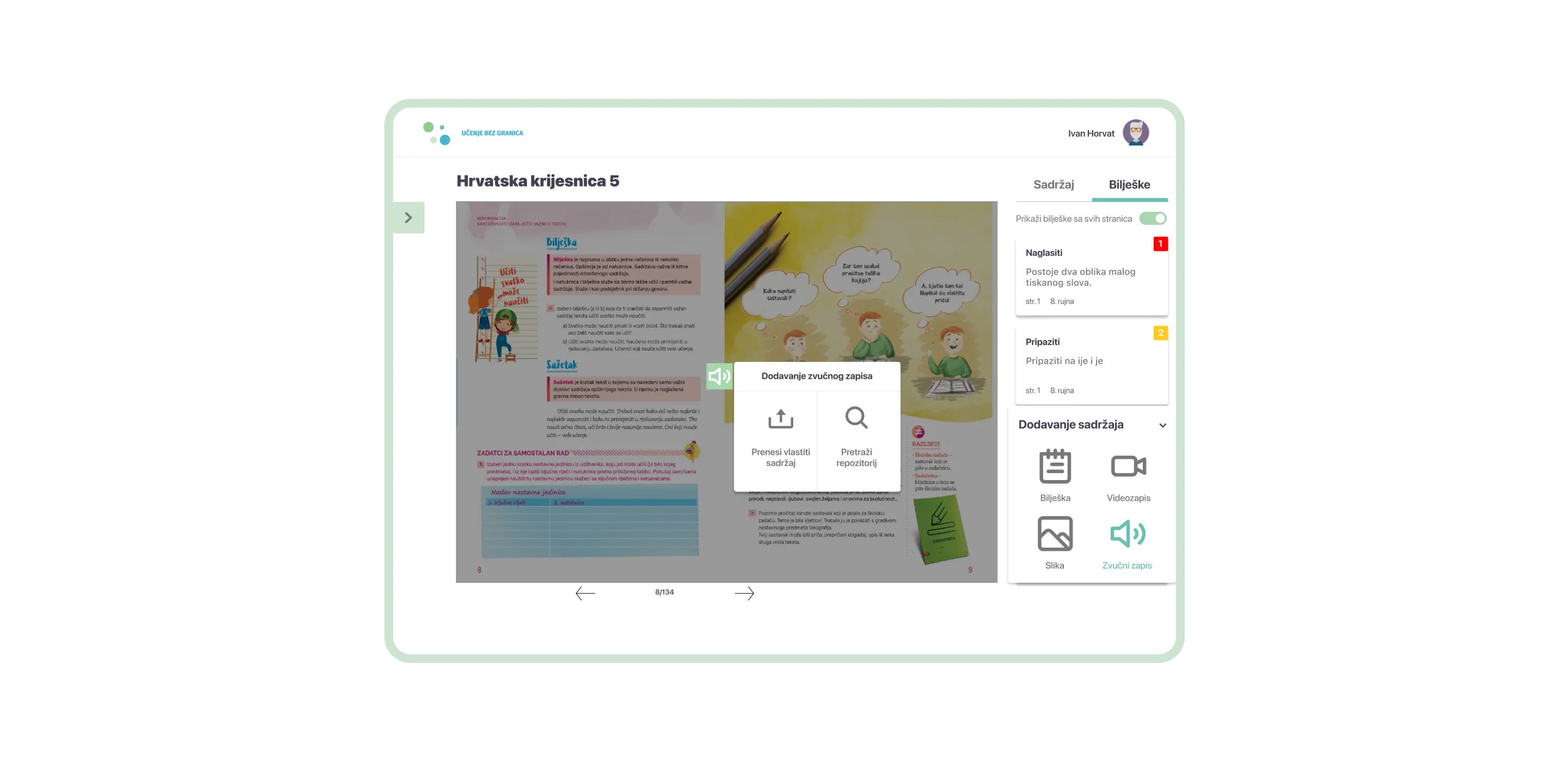
At the heart of the platform lies a powerful eBook reader that allows users to browse, annotate, and revisit materials anytime.
Teachers can prepare lessons in advance, while students can highlight, search, and revisit important sections — on tablets, laptops, or desktops.
Content Editor
We developed a content editor that empowers teachers to enrich lessons by adding multimedia elements — such as videos, images, and interactive exercises. This transforms static textbooks into dynamic, media-rich learning experiences that help students absorb knowledge more effectively.

Technology for modern classrooms
To support a seamless and scalable experience, the platform was developed using React.js for the frontend, ensuring flexibility and speed.
Interactive features were implemented with Fabric.js and PDF.js, while MobX handled complex state management across the application.

HTML5 APIs power the multimedia capabilities, enabling teachers to easily integrate content from various sources.
A learning platform that grows with its users
The final product is a clean, user-friendly, and interactive e-learning platform designed to meet the needs of both students and teachers.
It provides:
- A seamless digital reading experience
- Interactive multimedia integration
- Simple navigation and intuitive controls
- Compatibility across devices and age groups
Naklada Ljevak’s new platform represents a leap forward in digital education, redefining how teachers teach and how students learn — bringing the classroom of the future into the present.


