

Reimagining personal healthcare through thoughtful design and AI-powered simplicity

UX RESEARCH
UX/UI DESIGN
DESIGN SYSTEM
MOBILE DEVELOPMENT
BACKEND DEVELOPMENT
AI DEVELOPMENT
CMS DEVELOPMENT
USER ANALYTICS
QA & TESTING
Meddox is a digital health platform that brings medical records, health tracking, appointments, and AI-powered insights into one connected personal health experience.
Healthcare is deeply personal, yet managing it often feels anything but. Medical records live in filing cabinets, appointment confirmations disappear in emails, medication reminders compete with dozens of daily notifications, and laboratory reports remain understandable only to medical professionals.
Built as a mobile-first digital health platform, Meddox brings appointments, medical records, therapies, health tracking, AI-powered report analysis, personalized health education, and everyday wellness tools into a single, connected ecosystem. From tracking hydration, daily activity, BMI, glucose levels, and caloric balance to securely storing medical documentation, the platform helps users build healthier habits while staying connected to their healthcare providers. More importantly, it transforms healthcare from a fragmented administrative task into an experience designed around people.
Everything important. Exactly when you need it.
A Growing Platform Outgrows Itself
As new features were added over the years, the original application gradually evolved into a collection of disconnected tools rather than a unified product. Booking appointments, managing therapies, reviewing medical history, and monitoring health parameters all existed independently, forcing users to mentally stitch together their own healthcare journey. This fragmentation became particularly problematic in healthcare, where users often interact with products during stressful moments. Every additional tap, every unclear navigation pattern, and every unnecessary decision increased cognitive load when clarity mattered most.
Key Pain Points
The original system suffered from three main issues. First, there was no logical home base. Opening Meddox failed to answer the immediate questions users cared about most, such as daily medication tasks or upcoming appointments, forcing them to navigate deep into multiple menus instead.
Second, the visual language was actively counterproductive; aggressive reds dominated the interface, unintentionally creating strong associations with urgency, danger, and illness rather than reassurance and recovery. Finally, these visual issues were amplified by outdated mobile patterns and dense layouts that overall failed to deliver the calm, modern digital experience that healthcare deserves.
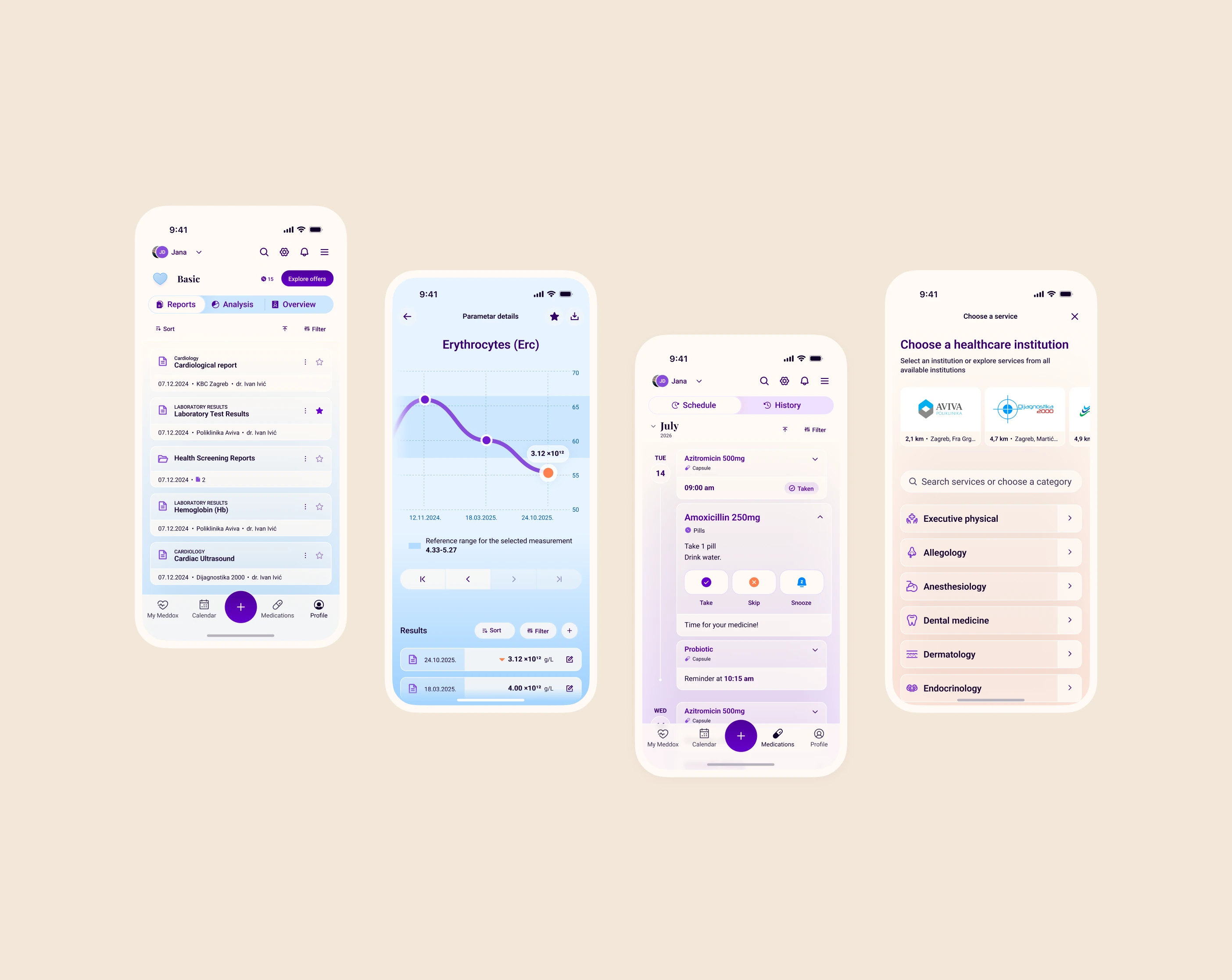
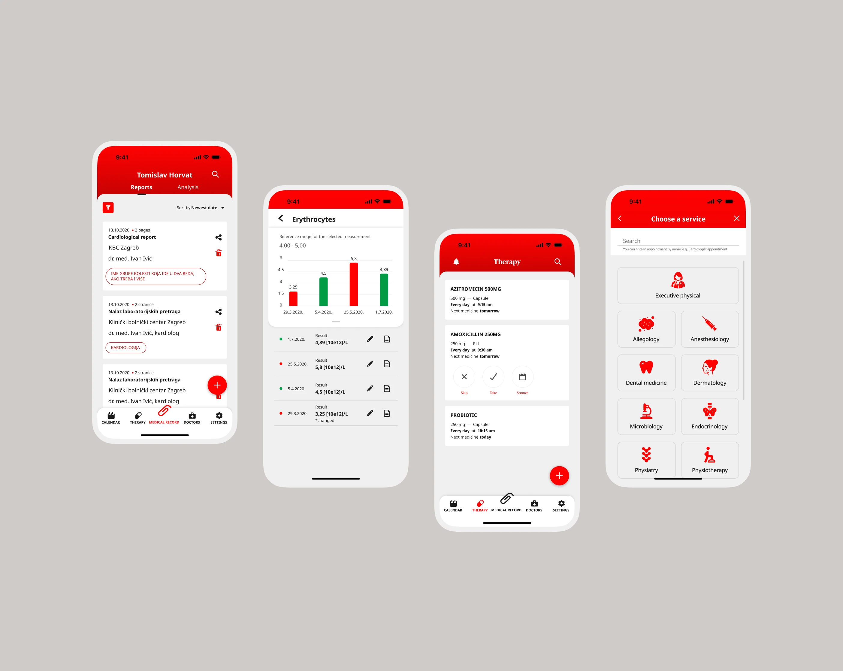
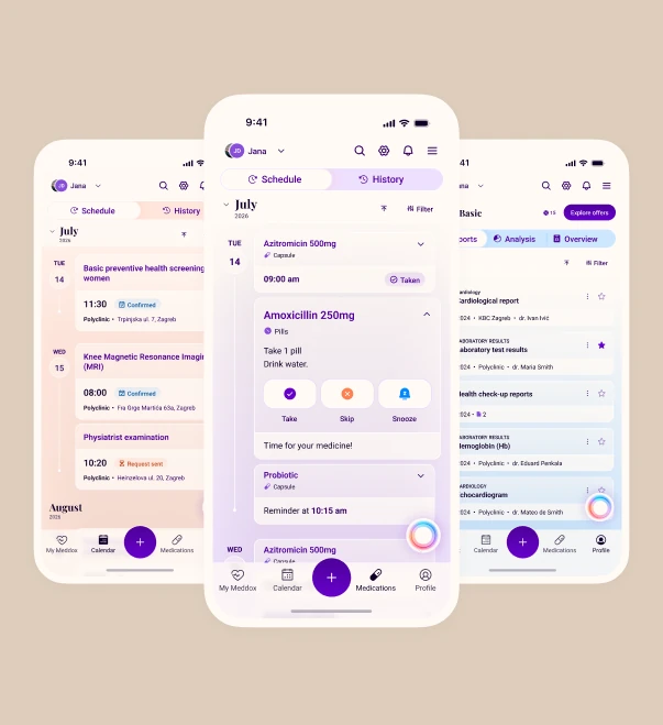
Drag to compare: from a fragmented, red-dominated interface to a unified, calming healthcare experience.
Clear, Dedicated, and Routine-Centric Spaces
- Global Quick-Action Hub: To eliminate the friction of navigating deep into menus, a persistent “+” button is accessible from any screen in the application. With a single tap, users can instantly trigger key workflows: booking an appointment, adding a medication reminder, scheduling a calendar event, or uploading a medical report.
- Calendar: Clinic visits and personal health events are consolidated into a dedicated Calendar view. This chronological hub keeps upcoming schedules clear and reduces the stress of missing critical dates.
- Therapies: Managing medication schedules is separated into its own distinct, dedicated workspace. Users can seamlessly view schedules, receive precise intake reminders, and check off completed doses without other administrative distractions.
- My MedID: Located securely inside the user’s personal profile, My MedID acts as a digital health passport. It consolidates crucial medical info, like blood type, allergies, chronic conditions, and active therapies, into a single, secure view that can be shared instantly in emergencies or at new clinics.
- Holistic Wellness Tracking: Directly on the main dashboard, users can easily monitor hydration, body weight, BMI, glucose levels, and caloric intake. These integrate natively with Apple Health or Google Fit to paint an overall picture of wellbeing, while premium users enjoy the added flexibility to completely choose and customize which specific health parameters they actively track.
- Multi-Profile Switcher: Parents and caretakers can switch instantly between family profiles with a single tap, keeping calendars, therapies, and medical records neatly separated yet highly accessible. While the basic plan introduces core profile management, upgrading to premium expands this ecosystem to allow an unlimited number of user profiles.
- The Premium Health Engine: To support business scalability while deepening user value, the redesign introduces a premium subscription tier that layers advanced clinical features on top of the foundational basic plan. Beyond unlocking unlimited family profiles and custom health parameters, premium membership upgrades the platform’s core AI summaries with doctor-approved medical recommendations, giving users high-confidence guidance next to their laboratory metrics. Furthermore, it transforms isolated health entries into a continuous, comprehensive medical history over time, turning raw documentation into a lifelong, evolving health timeline.

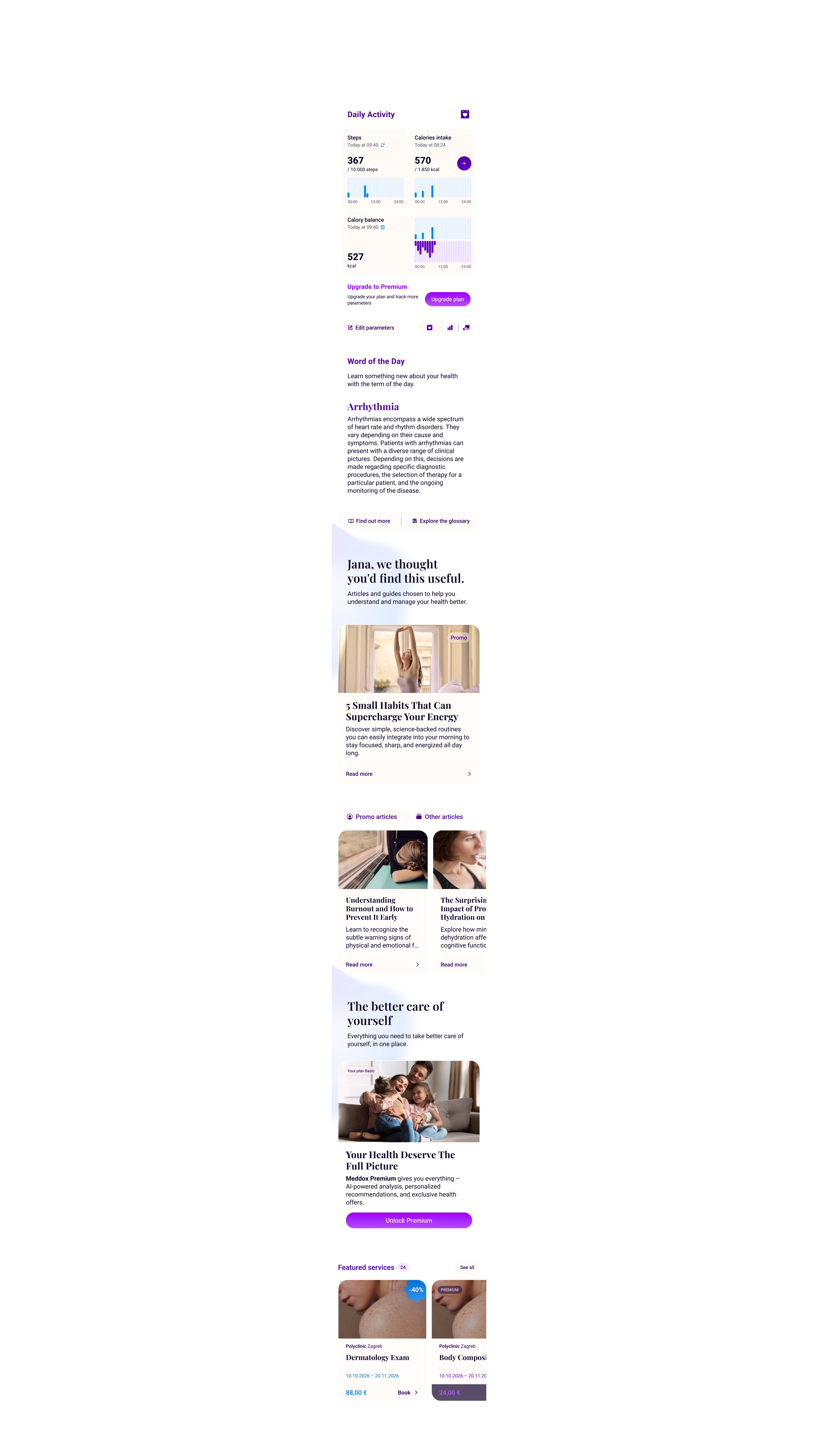




A single, intelligent interface that places everything the user needs to know right at their fingertips, combining vital signs and medical report tracking with personalized educational articles, and promotional healthcare clinic services.
Designing Around People, Not Systems
The redesign was about fundamentally rethinking how healthcare should feel, guided by the core principle: Reduce anxiety before reducing clicks.
To achieve this, the platform embraced generous whitespace, modular layouts, progressive disclosure, and stronger visual hierarchy to make complex medical data easily understandable at a glance.
Onboarding was also entirely overhauled to prevent overwhelming users before they even begin. Instead of lengthy, exhausting registration forms, Meddox utilizes mobile-native Action Sheets and progressive guidance, encouraging meaningful first actions, like uploading a report or scheduling a check-up, within the very first minute. Subtle animations and microinteractions reinforce these successful actions, quietly providing reassurance and keeping the user oriented.
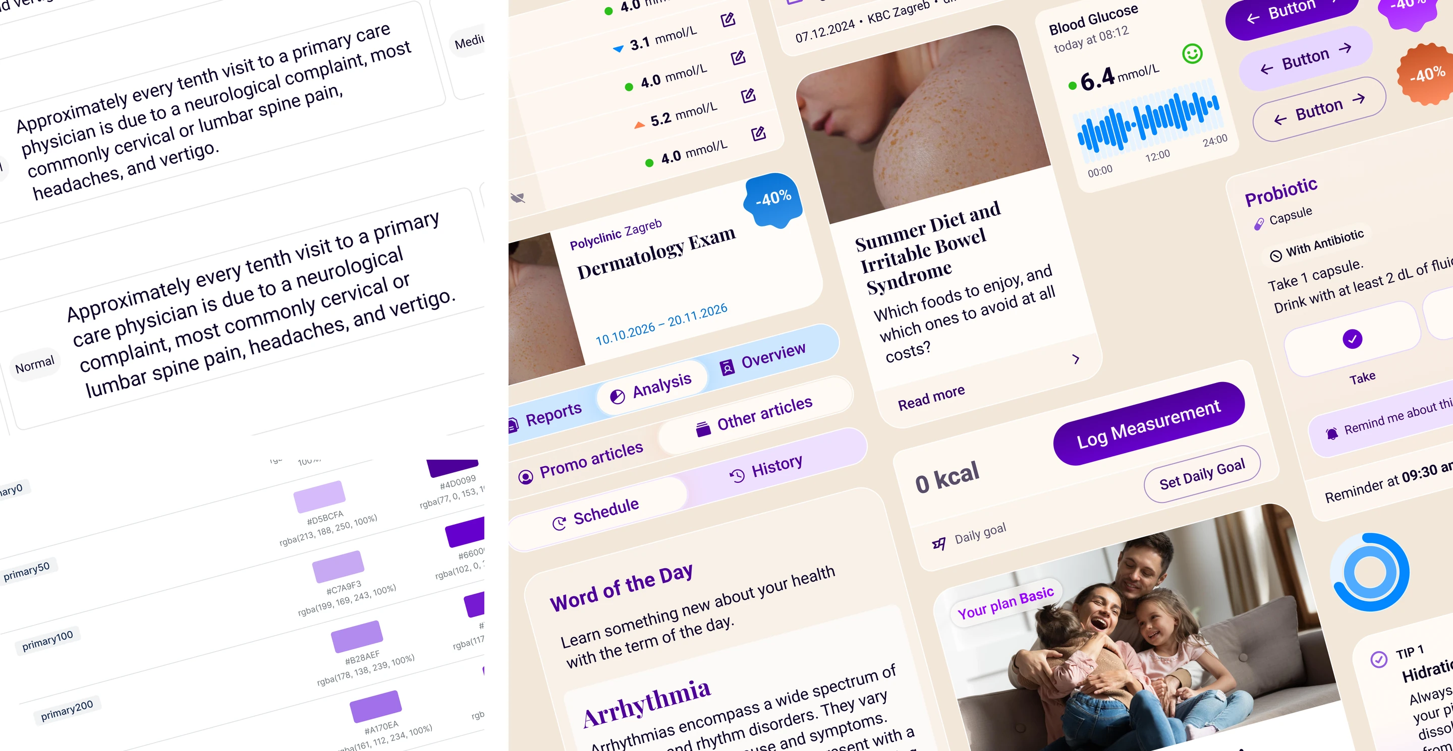
A scalable design system built for trust, accessibility, and long-term growth.
Navigating Technical and Medical Boundaries
Implementing automated medical report interpretation within a highly sensitive industry introduced critical operational boundaries:
The AI Boundary: The AI acts strictly as an intelligent interpreter, never a decision-maker. To mitigate clinical risks, every AI-generated insight is carefully framed as educational guidance rather than a clinical diagnosis.
Furthermore, medical reports arrive in countless formats, physical qualities, and layouts. Extracting reliable information means the system cannot rely on standard language models alone. To overcome these layout limitations and ensure absolute data accuracy, every document must pass through a strict multi-layered pipeline (OCR, document classification, structured validation, and medical parameter mapping) before the user manually reviews and approves it for storage.
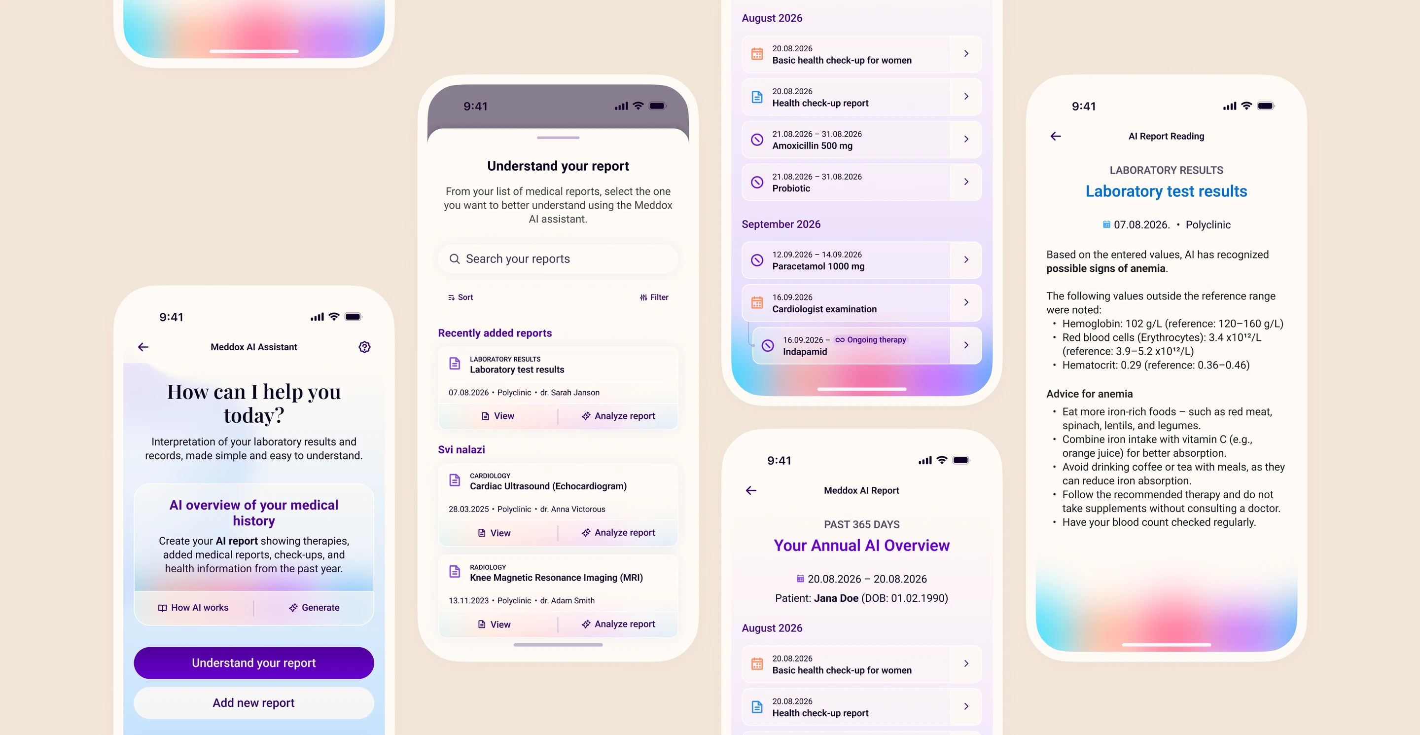
Meddox’s AI transforms complex medical reports into clear, plain-language analyses featuring doctor-approved recommendations, customizable parameter tracking, and a comprehensive lifelong health timeline.
Visual and Psychological Transformation
The visual identity was completely rebuilt from scratch to foster trust, scalability, and long-term engagement.
The aggressive reds of the legacy app were replaced with calming purples, soft blues, and carefully balanced neutral tones that communicate trust, confidence, and care.
Rather than treating accessibility as an afterthought, the system standardizes larger typography, improved contrast ratios, refined element spacing, and full Dark Mode support to remain comfortable across varying age brackets and lighting environments. These decisions were codified into a unified, atomic component library spanning modular cards, consistent button states, clean form layouts, and specialized health widgets to ensure long-term design consistency.
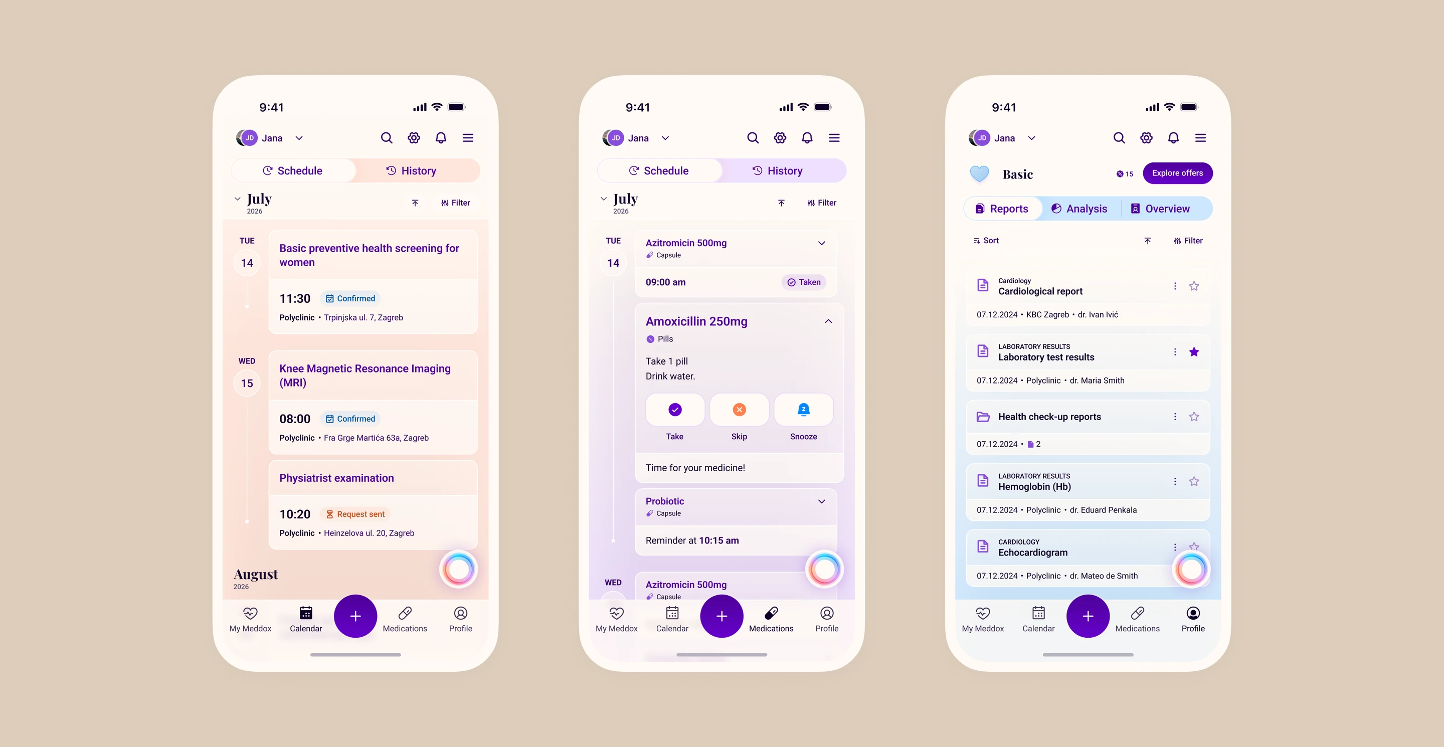
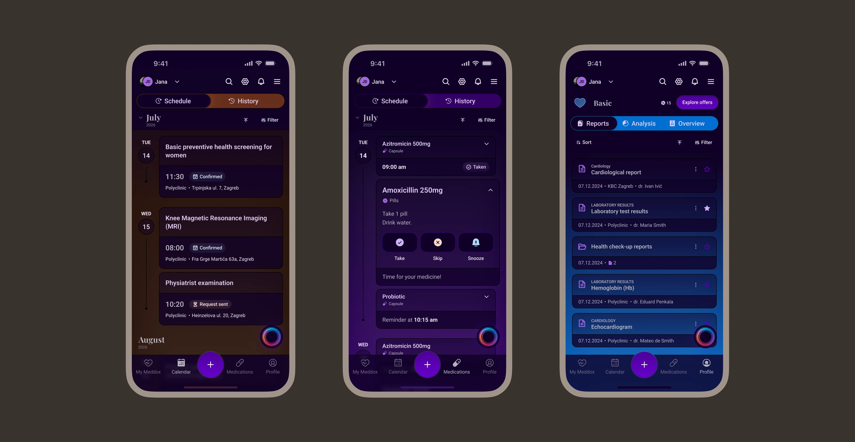

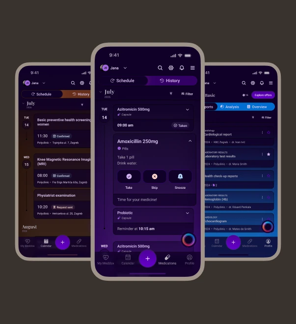
The new design system introduces clear, color-coded domains to simplify navigation at a glance: Orange for booking appointments, Purple for active medication tracking and intake reminders, and Blue for accessing personal medical charts and history.
Rebuilding the Foundation
Putting People First
Healthcare shouldn’t begin only when something goes wrong; it should be integrated beautifully into everyday life.
By combining empathetic design, connected healthcare services, and highly disciplined AI utilities, Meddox has successfully shifted from a fragmented administrative tool into a centralized personal health companion. The platform effectively lays the foundation for a future where managing personal health feels less like stressful bureaucracy and more like everyday empowerment.