

Digital transformation for the UK’s fastest-growing insurance provider

What this insurance transformation demonstrates
CoreLine joined Insync as a long-term product and engineering partner, replacing agent-heavy customer journeys with custom quotation applications, an agent portal, and centralized customer self-service. The public evidence supports digital insurance workflow and platform modernization - not an AI underwriting claim.
- 4+ years documented partnership
- The published delivery record describes more than four years embedded in the client's broader organization.
- 10 disciplines listed delivery scope
- Strategy, architecture, research, design, web, mobile, embedded development, analytics, and quality assurance are listed in the case record.
- Agent + customer connected workflows
- The delivered scope includes agent operations, insurance quotation flows, policy documents, renewals, updates, and claims reporting.
Evidence basis: CoreLine's delivery record and the attributed client testimonial linked to the original Clutch review.
Scope note: No project-specific conversion uplift or AI underwriting result is claimed on this page.
STRATEGY
SYSTEM ARCHITECTURE PROTOTYPING
USER TESTING
UX DESIGN
UI DESIGN
WEB DEVELOPMENT
MOBILE DEVELOPMENT
EMBEDDED DEVELOPMENT
DATA ANALYTICS
QUALITY ASSURANCE
Insync Insurance Solutions Ltd. is a UK-based insurance provider that focuses on offering Beauty, Medical, Business, and Specialist insurance products for SME clients.
The majority of the UK’s insurance providers still heavily rely on live agent support during the customer journey. To determine itself further from the rest of the market, Insync decided to transform its way of working through a synergy of digital servicing and personal expertise.
The goal was to utilize technology to smoothly and efficiently manage the customer journey without compromising the customer relationship or sacrificing the human touch.
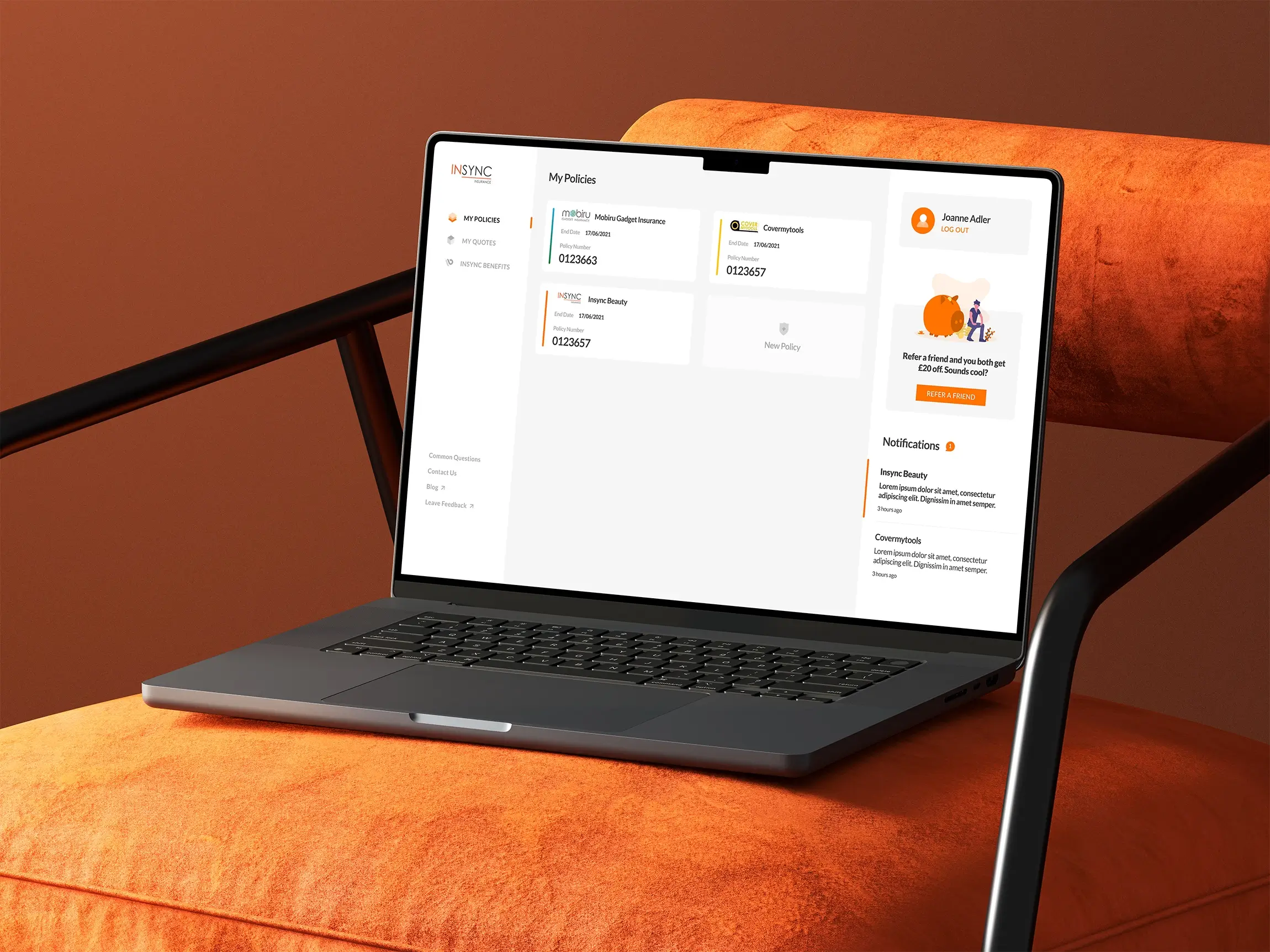
Both professional design and complex programming solutions were delivered, making full digitalization of clients processes a reality
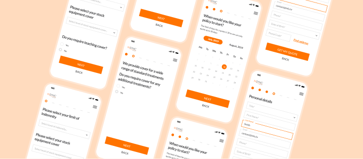
The aim was to simplify and modernize how people buy insurance
In England, insurance is a big part of life, but the process to get it, or even make small changes was outdated. Surprisingly, it still relied heavily on agents handling everything for clients. While it no longer required face-to-face meetings, most of the work was still done over the phone. Initially, we developed a long, single-screen form based on the client’s requirements. However, through analysis of its usability and analysis based on competitor solutions, it became clear that this approach overwhelmed users. Our clients system was extensive, with complicated steps not just for creating a policy but also for updating it, renewing it, or even accessing documents.
Checkout research provides useful context but is not an Insync outcome. Baymard’s 2025 survey data reports that 18% of surveyed US online shoppers had abandoned a purchase because checkout felt too long or complicated. Insurance journeys differ from retail checkout, so we used that evidence directionally: we broke long forms into smaller steps and reduced perceived complexity without claiming a project-specific conversion lift.
Control is placed directly into the hands of the users
- Intuitive and accessible customer interface
- Organized database for tracking simplification
- Speed up the process through personal data forms
- Policy buying process automatization
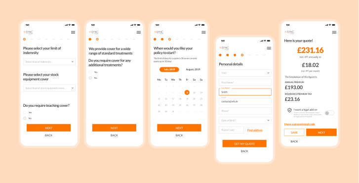
Solution didn’t just simplify things for users; it also reduced the workload for agents
- Simplified complex processes with step-by-step guidance
- Developed a centralized portal for easy policy management
- Enabled online updates with minimal agent involvement
- Introduced hybrid support for users needing assistance
While focusing on simplification of a complex process, we were addressing a common issue: lengthy, single-screen forms that often led to agitation. Dividing the process into clear and intuitive steps allowed users to get a pre-calculated quote after answering just a few initial questions. With this approach we fight users’ tendency to abandon the process by making it user-friendly and less overwhelming. By allowing users to feel comfortable and in control, the process reduces frustration and encourages them to complete the remaining steps at their own pace.
At the core of the design is the centralized customer portal. It allows users to access all their policies, saved quotes, and relevant documents in one place. Progress can be saved mid-process, enabling users to return within 30 days to complete their purchase without starting over. Design flow aims to minimize the chances of losing important information or experiencing confusion about multiple policies.
By digitalizing tasks like updating customer information, which can now be done entirely online, we the need for direct client interactions was reduced, allowing both users and agents to focus on more meaningful tasks. For older users or those who still prefer agent support, we still implemented a hybrid approach. Agents can assist clients by setting them up in the customer portal, ensuring they have access to everything they need while briefly explaining the process.
Rather than being restricted by these external factors, our goal was to create a smooth and reliable experience for users
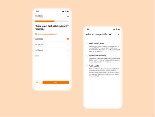
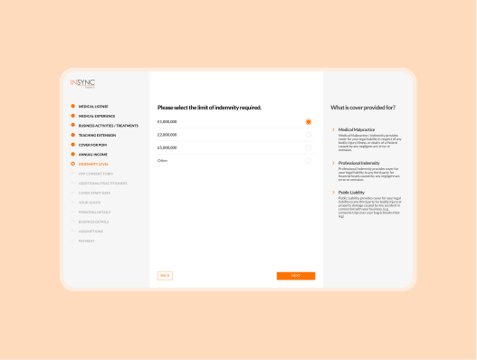
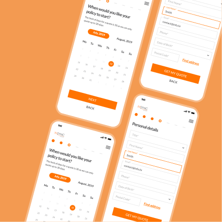
Redesigned customer journey
The insurance purchasing process is known to feel overwhelming, leading many users to abandon it before completion. Maintaining a cohesive visual identity across all insurance products was our primary design goal, ensuring a consistent look and feel, which helped us build confidence in users and make navigation straightforward.
Legal requirements meant that all necessary policy information had to be displayed throughout the form. To avoid cluttering the screen and overwhelming users, two design flows were created: one for desktop and one for mobile. On the desktop version, important information is placed in a sidebar for easy reference, while on mobile, the same information is accessible through clickable question marks. This way, users have all the details they need without feeling overloaded, helping them stay focused on the forms they are filling out.
User feedback also highlighted issues with unclear questions and forms that were difficult to complete, especially on different devices. These problems often led to incorrectly completed forms or users abandoning the process altogether. To improve this, every question was redesigned to be intuitive and simple, ensuring a smoother experience. For instance, a price slider was added with values set at increments of 1000, making it clear and easy for users to select the appropriate value while also creating a more satisfying interaction.
A centralized customer portal was also designed to provide users with a single point of access for managing their policies. From tracking policy updates to reviewing documents and reporting claims, the portal consolidates all necessary actions in one place. Built to be scalable, it allows Insync to expand and adapt their services without overhauling the system, all while easing the workload on customer support teams.